Widgets
Klaxon has three windows:
- Klaxon HUD overlay (
?panel=klaxon) — small, transparent, undecorated, always-on-top panel for ambient awareness of open items. Custom drag/pin chrome viaDraggablePanel. - Form HUD overlay (
?panel=form) — small, transparent, undecorated, on-demand panel for quickly filling a form without leaving your current window. Hidden until needed. - Main window (
?panel=main) — normal OS-decorated 1000×700 window with a Slack-style sidebar / list / detail / settings layout. Folds in everything except the two HUDs.
All three windows persist their position, size, and (HUD-only) always-on-top flag across launches via the window_state SQLite table.
Klaxon HUD
The ambient notification display. Shows all open klaxon items as cards with level indicators, action buttons, and TTL progress bars. Lives over your other windows so you don't miss anything.

Each card shows:
- Level badge — colored dot (blue=info, yellow=warning, red=error, green=success)
- Title and message — markdown-rendered message body
- ↗ Open in main — deep-link the item into the main window's detail pane
- Ack / Dismiss buttons — acknowledge or remove the notification
- Custom actions — agent-defined buttons (ack, open URL, run tool)
- Open Form — for items with attached forms, opens the Form HUD for a quick fill
- TTL bar — countdown progress bar for time-limited notifications
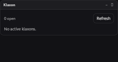
When no notifications are active, the panel shows an empty state.
Form HUD
A small overlay form wizard that opens when the user clicks "Open Form" on a klaxon card. Designed for quick fill — pops up over your current window and dismisses itself on submit. Supports:
- Single-page forms with multiple field types
- Multi-page wizards with Next/Back navigation and progress dots
- Conditional branching — page flow determined by field values
- Validation — required fields, min/max length, patterns, number ranges, file size and MIME, repeating-group min/max rows
For longer or more contextual workflows, the same form schema also renders inline in the Main window's detail pane (see below).
Main Window
A Slack/Teams-style three-pane layout. Use this when you want to triage, browse history, fill larger forms, or change settings.
┌─────────────┬────────────────────┬───────────────────────────┐
│ KLAXON   ⟳  │ Search...     ×    │ ┌── Item Detail ───────┐ │
│             │ Anytime Today 7d   │ │ ● Title              │ │
│ ▶ All       │ Newest | Active    │ │   P1 · Due in 17m    │ │
│   Open  [3] │ ─────────────      │ │   #channel  tag tag  │ │
│   Answered  │  ☐ [item card]     │ │   message...         │ │
│   Dismissed │  ☑ [item card]     │ │ ─────                │ │
│   Snoozed   │  ☐ [item card]     │ │ Form / Response      │ │
│   Archived  │  ☐ [item card]     │ │ ─────                │ │
│             │                    │ │ [Ack] [Dismiss]      │ │
│ ── CHANNELS │                    │ │ [Snooze] [Archive]   │ │
│   #deploy   │                    │ │ Custom actions...    │ │
│   #review   │                    │ └──────────────────────┘ │
│             │                    │                          │
│ ── VIEWS  + │                    │                          │
│ ★ On-call   │                    │                          │
│ ★ Today's   │                    │                          │
│             │                    │                          │
│ ⚙ Settings  │                    │                          │
│ ? Help      │                    │                          │
├─────────────┴────────────────────┴──────────────────────────┤
│ ● MCP :49301   2 agents                  Last sync 12s ago  │
└─────────────────────────────────────────────────────────────┘
Sidebar
The left column has four sections plus the system entries at the bottom:
Filter views
| View | Shows |
|---|---|
| All | Every non-archived, non-withdrawn, non-snoozed item |
| Open | Items with status: open. Carries an unviewed-count badge that drives the OS tray tooltip. |
| Answered | Items with status: answered |
| Dismissed | Items with status: dismissed |
| Snoozed | Items where snoozed_until > now(). Hidden from every other view. |
| Archived | Items where archived_at IS NOT NULL. Hidden from every other view. |
The Open view shows a small badge with the unviewed count whenever there are items the user hasn't opened in the main window yet. Clicking an item marks it viewed and the badge ticks down.
Channels
Dynamically populated from any unique channel values currently set on items. Click #deploy to filter the list to that channel. Empty section when no items have channels.
Views (saved filter combinations)
Each saved view captures the current sidebar selection, date range, and search text. The + button next to the section header opens a name prompt that saves the current state as a new view; clicking a row applies it; the × next to each row deletes it. Persisted to the saved_views SQLite table — survives restarts.
System entries
- ⚙ Settings — swaps the right area to the four-tab settings view (Theme / MCP / Notifications / Templates).
- ? Keyboard help — opens the keyboard shortcuts overlay (same as pressing
?).
The sidebar also has a refresh button (⟳) at the top right of the title bar as an escape hatch for when the auto-refresh event listener falls behind.
Item list
The middle column has a filter strip on top and the scrollable list below.
Filter strip
- Search box — debounced 150ms. With 2+ characters, calls the
klaxon_searchTauri command which runs SQLLIKEagainst title and message across the entire DB (not just the recent 500 in memory). The inline…spinner shows when a query is in flight; the×clears the query in one click. - Bulk action toolbar — replaces the search box when at least one item is checked. Shows
{N} selectedand four buttons: Archive, Dismiss, Mark viewed, Clear. - Date range chips —
Anytime/Today/7d/30d. Composes with the sidebar / search filters in the in-memory filter pipeline. - Sort toggle —
Newest(bycreated_at, default) orActive(byupdated_at, surfaces items recently touched byklaxon.update). - "Mark all as viewed" link — appears under the search box on the Open filter when there are unviewed items. Loops
klaxon_mark_viewedover every unviewed open item.
Item cards
Each HistoryCard displays:
- Unviewed dot — small blue dot before the title for items that haven't been viewed yet
- Multi-select checkbox — toggle to add to the bulk-action selection
- Level dot — colored left border by severity
- Title + relative time
- Status pill
- Priority chip — colored P0/P1/P2/P3 chip when
priority > 0 - Deadline chip —
Due in 17mcountdown that turns red when imminent (<1h) or overdue - Channel chip —
#deploystyle chip - Tag chips — small grey chips
- Truncated message — single-line preview
Right-click any card to open the context menu:
- Open in detail pane — always shown
- Ack / Dismiss — open items only
- Snooze 1 hour — open, non-snoozed items
- Wake (unsnooze) — currently snoozed items
- Archive — items in any status that aren't already archived (it's an orthogonal hide flag, not a workflow state — you can archive an open item directly from here without dismissing it first)
- Unarchive — already-archived items
- Copy item ID — always shown
- View raw JSON — opens an inspection modal with the full serialized item
Closes on Escape, click outside, scroll, or window blur.
Empty states
- Database empty — first-launch CTA with two buttons: "Connect an MCP agent" (jumps to Settings → MCP) and "Try sample data" (calls
demo_seed). - Filtered empty — per-view friendly message ("No open klaxons", etc.) when items exist but the active filter has nothing.
Detail pane
The right column shows the selected item:
- Header — level dot, title, status, age, and a contextual button row:
- Open items: Ack, Dismiss, Snooze
- Snoozed items: Wake (snoozed)
- Finalized items (answered / dismissed / expired) that aren't archived: Archive
- Archived items: Unarchive
- Channel + tag chips — repeated under the header for visibility
- Message — markdown-rendered
- Custom actions — agent-defined buttons (calls
klaxon_run_action) - Form (interactive) — when the item has a form and is still open, the form renders inline. Submit answers it and the item moves to "answered" without leaving the window. If the Rust validator rejects the submission (e.g. a required field was missed) the error message renders in a red
role="alert"banner above the form so the failure is visible — there's no silent "the submit button just did nothing" path. The error is cleared automatically when you switch to a different item. - Response (read-only) — when an item is already answered, the response is rendered through the same
FormFieldRendererin disabled mode so each field shows the answered value in its native widget.
Snooze picker
Clicking the Snooze button on an open item opens a small popover with preset durations:
- 1 hour
- 4 hours
- Tomorrow morning (next day at 09:00 local)
- Next Monday (next Monday at 09:00 local)
Each preset shows the absolute clock time as a hint. A 60-second background ticker on the Rust side automatically clears snoozed_until when the deadline passes, surfacing the item back into the Open view.
Undo toast
Dismissing or archiving an item shows a 5-second undo toast at the bottom-center of the main window. Clicking Undo (or pressing Cmd/Ctrl+Z) calls the inverse Tauri command (klaxon_restore for dismiss, klaxon_unarchive for archive). The toast has a shrinking progress bar so you can see how much time is left.
Keyboard shortcuts
| Key | Action |
|---|---|
J / ↓ | Move selection to next visible item |
K / ↑ | Move selection to previous visible item |
Enter | Open the selected item (or the first if none) |
Esc | Cascading clear: kbd help → JSON modal → context menu → search box → multi-selection → single selection |
A | Ack the selected open item |
D | Dismiss the selected open item |
R | Archive the selected finalized item |
U | Unarchive the selected archived item |
X | Toggle multi-select on the selected item |
/ | Focus the search box |
? | Toggle the keyboard help overlay |
Cmd/Ctrl+Z | Trigger the most recent undo |
Shortcuts are window-level — they don't fire while the search input has focus (except Esc, which is always honored).
Status bar
The bottom 22px of the main window shows:
- MCP status — colored dot + bound port (or "offline")
- Agent count — number of unique agents that have ever talked to this instance, from the persisted
mcp_agentstable - Schema-drift badge (dev only) — when items arriving from the backend fail Zod parse, a red
⚠ N droppedbadge appears between the agent count and the sync time. Gated behindimport.meta.env.DEVso production builds never show it. Hover the badge for a tooltip explaining the likely cause (stale@klaxon/protocolreference, Rust ↔ TS schema drift); the failing items + Zod errors are in the console. The Klaxon HUD has the same badge in its panel header. - Last sync — relative time since the last successful refresh (re-renders every 30s)
Settings tabs
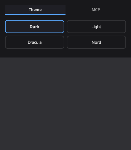
Selecting the ⚙ Settings sidebar entry replaces the list + detail panes with a four-tab settings view.
Theme
Choose between Dark, Light, Dracula, and Nord themes. Theme changes broadcast to all panels instantly via the settings.changed Tauri event.
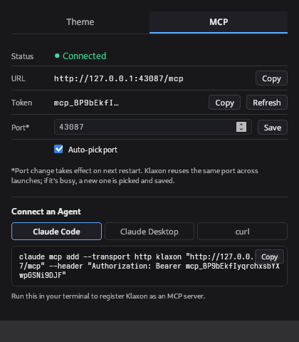
MCP
Shows the MCP server connection status, URL, and bearer token with copy buttons. Lets you refresh the bearer token, configure a preferred port, and toggle auto-port. Includes copy-paste connection snippets for Claude Code, Claude Desktop, and curl.
Screenshots
The Theme and MCP screenshots above were captured before the main window restructure — the controls themselves are unchanged but they now live as tabs inside the main window's settings view rather than in a standalone Settings window.
Notifications
Three sub-sections:
- Quiet hours — toggle, start time, end time (24h
HH:MM), and a per-level allow list (defaults toerrorso on-call pages still go through). Wrap-around windows like 22:00 → 07:00 are handled — both 23:00 and 03:00 are inside the window. The notification firing path consults this and the per-channel rules below before showing a desktop alert; the items still appear in the HUD and main window regardless. - Auto-archive — numeric input for
auto_archive_after_days. A 24h background ticker callsKlaxonStore::auto_archive_sweepand archives every finalized item whoseupdated_atis older than the threshold.0disables the sweep. - Channel rules — table of per-channel notification overrides. Each row has a
modedropdown (All / Errors only / Muted) and asounddropdown (Default / None / Alert), plus a delete button. The+ Add rulerow at the bottom creates a new rule with default settings. - Backup & restore — Export button writes a versioned JSON file to the current directory; Import takes a path and re-creates each item idempotently (skips items whose ids already exist).
Templates
The klaxon_templates table editor:
- Left column lists every saved template by name with its current version.
- Selecting a template loads its form schema as pretty JSON into a textarea editor. Live Zod validation surfaces parse errors inline and disables the Save button until the schema is valid.
- The right pane is a live
FormWizardpreview rendering the parsed schema exactly as an agent'sklaxon.ask { template: "..." }call would show it. - + New template prompts for a name and creates a starter schema.
- Save bumps the version counter on the Rust side.
- Delete asks for confirmation, then removes the row.
Channels and tags
Both fields are optional inputs on every creation tool (klaxon.notify, klaxon.ask, klaxon.confirm, klaxon.choose):
channel: string— single label that drives the sidebar grouping and the per-channel notification rules.tags: string[]— free-form labels rendered as small chips.
These are stored in SQLite and survive restarts. There's no channel-creation UI — agents just set the string and the sidebar populates dynamically.
Form field types in the wizard
The FormWizard (used by both the Form HUD and the inline detail pane) walks the form's pages and renders each field via FormFieldRenderer. Every field type has a dedicated renderer — see the MCP API reference for the full table and schema. Highlights of the less-obvious renderers:
fileupload—<input type="file">with the configuredacceptMIME list. On change, the file is read viaFileReader.readAsDataURL, thedata:prefix is stripped, and the result is stored as{ filename, mime, size, data }(data is base64).taginput— Linear-style chip input. Type and press Enter or comma to commit a chip; backspace removes the previous chip; suggestions appear in a small autocomplete dropdown.repeat— repeating group of sub-fields. Each row is a sub-form with the inner fields, plus a×button to remove. The+ Add rowbutton respects the configuredminandmaxrow counts.yesno— pair of pill buttons (rather than a slider toggle). The visual is unambiguous for binary questions.